

How Do You Measure Responsiveness of a Website
A static website design that looks excellent on a computer screen is no longer sufficient because people increasingly access the internet from mobile devices. Not to mention, when creating a design, you must take into account tablets, 2-in-1 computers, and smartphones with various screen sizes. Every web designer should be familiar with the fundamentals of responsive web design or how to make your sites look great. The responsiveness of a website on different devices is a driving indicator for business growth.
For more than 80% of adults, a company's mobile website needs to be just as good as its desktop website. Based on this statistic, we can make an informed assumption about the popularity of responsive web design. The technical obstacles are eliminated by responsive web design solutions, which provide an excellent user experience.
What is Responsive Website Design?
Responsive design allows websites to adapt to various screen sizes while maintaining functionality and the user experience. Text, UI elements, and images scale and resize based on the viewport.
For instance, your content may be divided into different columns on desktop screens, as they are large enough to accommodate that design. However, users will need help to read and interact with your content if you divide it into multiple columns on a mobile device. Responsive design allows you to deliver different layouts of your content and design to other devices based on screen size.
Responsive web design assists you in avoiding the following:
- incorrect resizing
- inconvenient scrolling
- inappropriate zooming
- wrong panning
Due to responsive design, developers can create a particular set of HTML, CSS, and JavaScript code for many devices, software platforms, and browsers. Making an existing website responsive can be challenging, but early development investments in responsive web design surpass the difficulty.
Why is Responsiveness of a Website Important?
If you're new to website design or development, you might wonder why responsive design is essential. The solution is simple. It is no longer satisfactory to design for a single device. Mobile accounts for about half of all web traffic globally. Mobile devices (excluding tablet devices) accounted for around 58% of global website traffic in the second quarter of 2022.
According to these statistics, the use of mobile devices is increasing every day, which implies that more customers will view your website from mobile devices. If your website responds smartly on mobile, users will probably shift their focus to a competitor's website.
When more than half of your potential visitors use a mobile device to surf the internet, you can serve them a desktop-designed for a desktop. However, it would be difficult to read and use, resulting in a poor user experience.
Why is Responsive Website Design Testing Important?
The number of people using their smartphones for social media, shopping, informational purposes, and entertainment is increasing daily. Therefore, your website must be accessible on multiple devices and mobile-friendly.
Avoid issues with your site's responsibility to give your users the most excellent experience possible. Testing responsive designs is the best option. After you have successfully created a responsive website, you must test it to ensure that it can:
- Consistently display and align the content.
- The text should be viewable at all scales and viewports.
- Keep text and images within their respective containers.
- Images can be shown and resized as needed.
- Users should be able to scroll vertically or horizontally.
- Allow users to navigate through links and menus on all devices.
- Mobile devices scale or resize content based on portrait or landscape orientation.
You can check responsiveness of a website in the following ways:
- First, use specialized tools to assist you with this.
- Then, check it with your browser, such as Google Chrome.
Responsive Web Design Testing Tools
Web designers and testers have a nightmare because of the enormous increase in the number of devices at our disposal. The web application should accurately show every page on all multi-dimensional devices. There are several browser-based and standalone tools that you can use to check the responsiveness of a website. We'll walk you through a carefully picked list of the best tools for measuring the responsiveness of a website.
BrowserStack
More than 36,000 customers, including Twitter, Microsoft, and MasterCard, use the BrowserStack tool. It is constantly growing, and you can now test your site on over 3000 real devices and browsers.

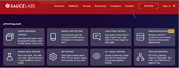
Sauce Labs
Development teams can use Sauce Labs to perform automated and live testing of web and mobile applications on large numbers of browser and operating system combinations, mobile emulators and simulators, and real devices, all from the cloud.
Viewport Resizer
It is a browser extension that allows you to see how your site looks in different formats. Install the extension, navigate to the page you want to test, and check all of the page's screen resolutions.
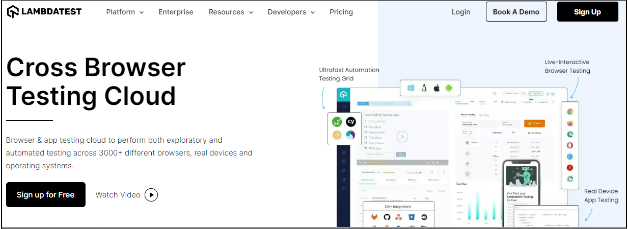
LambdaTest
It is a cloud-based cross-browser testing tool that enables you to test web applications across over 2000 browsers, operating systems, and devices. LambdaTest supports both manual and automated cross-browser testing. By performing cross-browser compatibility testing, you can ensure that your web application or website is compatible with almost every browser and device on the market.
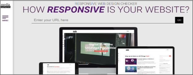
Responsive Design Checker
It was developed in 2012 as a test for Media Genesis developers to see if they could build a tool for testing websites for mobile design. As it turned out, it was a huge success! In addition, non-development web users valued Responsive Design Checker more because it could determine whether a website would be responsive in mobile format.
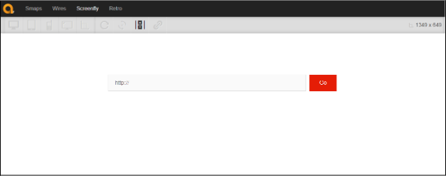
Screenfly
The Screenfly tool lets you see your website's appearance on various devices and screen resolutions. You can view your site's display without issue, and it is available on phones, laptops, computers, & tablets with various screen extensions.
Testsigma
This tool does thorough automatic responsiveness testing on your websites and applications using over 2000 iOS and Android devices and over 1000 browser-OS devices. In addition, it provides drill-down test reports, parallel testing of test suites, scriptless automation testing, and many other features.

Am I Responsive
It offers four different viewports to its users: desktop (1600 x 992 px), laptop (1280 x 802 px), tablet (768 x 1024 px), and mobile (320 x 480 px). It makes it possible to compare all these varied sizes together. It is quick, easy, and convenient to use.
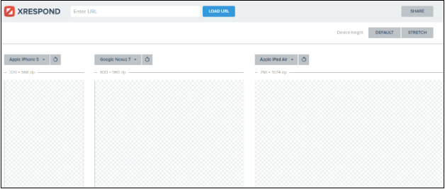
XRespond
It is a virtual device lab for responsive website design, development, and testing. The simple approach allows you to compare websites side by side as if you were looking at various devices on a wall in front of you. You aren't even required to leave your desk, laptop, or browser. You can start comparing websites right away with no setup.
Use Google Chrome to Check Responsiveness of a Website
Steps for using Google Chrome to measure the responsiveness of a website:
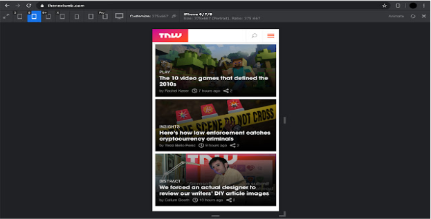
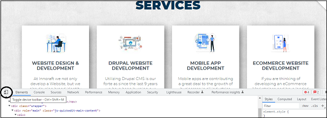
- In the Google Chrome tab, navigate to the site you want to check. We used our website as an example.

- Right-click on the website's landing page and click "Inspect."
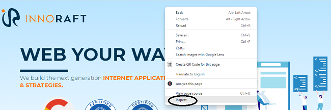
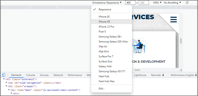
- Next, click on the "Toggle device toolbar," as shown in the image.
- You can now see several mobile screen sizes and orientations to see how the layout & elements adapt to various viewports, quickly identify & fix errors, and see real-time changes.
Conclusion
We have entered a new era of web design and development. We should instead usher in a new era by developing websites that are future-ready right now. Understanding how to make a website responsive takes little time or effort. It can be less stressful and more effective than learning to create and code correctly for every device available.
Responsive website design is a concept that, when used appropriately, can increase user engagement but only partially address all user, device, and platform issues. We must recognize the importance of responsive web design for business growth and continuously work with new devices, resolutions, and technologies to boost the user experience as technology changes in the years ahead.
At Innoraft, we have specialized web design and development teams that have launched numerous web projects successfully. If you have any questions about website design, get in touch with our experts.


