

Why Is Responsive Web Design So Popular in the World?
One of the essential requirements to ensure more website visitors is to have a responsive web design. It will help the visitors to access the website without unnecessary zooming, resizing, etc. This article will delve into detail about why websites must be responsive.
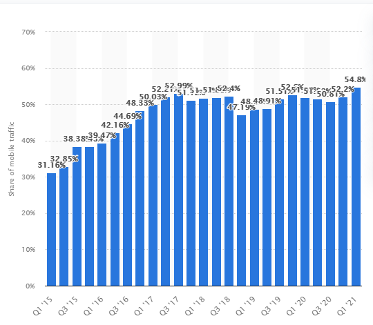
The increased penetration of smartphones has made businesses tweak their online strategies too. A study by Statista shows that mobile devices generated around 54.8% of the global internet traffic. (Source: Statista) Developers must optimise the website to the fullest, ensure seamless viewing for handheld device users, and improve conversions.
What is a Website Responsive Design?
Studies show that 57% of users say they will not recommend anyone to transact with a poorly designed mobile website. The needs of a website responsive design require that the developers respond to the website visitors' requirements. This practice involves various layouts and grids, along with the images and the use of CSS media queries.
The website's design must be such that it can respond to the environment and the screen size. As the user shifts the devices, the resolution of the website must change too. It should respond to the user requirements. It involves finalising a new way of designing the website optimally. It is also necessary from the SEO point of view, as being responsive is considered a critical ranking parameter by Google.
How do Responsive Web Design Work?
One of the basics is that these sites work optimally on all devices. These websites check the size of the device screen and adjust the dimensions and fonts accordingly. Keep in mind that your website should not have high-resolution images, loads of multimedia and other engaging elements that will slow down the website.
It is possible to design responsive sites using CSS and HTML. Various settings can serve different style properties. It can depend on the screen resolution, size, colour capability, orientation, etc. You can also take the help of renowned content management systems (CMS) that supports the functionality needed for a responsive website design.
Benefits Of Responsive Website Design
Improved search visibility
We have already mentioned that a responsive design is a critical parameter for search rankings by Google. Having a responsive website allows you to have a focused link strategy. It also allows you to have a consolidated SEO strategy across all devices. You need not be worried about duplicate content, as you need to concentrate your content on a single site.
Saves development resources
Developers are constantly under pressure to deliver their website projects on time. The use of a responsive website design takes less time in developing a standalone website that would cater to all devices. You need not test different websites, and that saves a lot of resources for you. Maintenance is more manageable, too, as you must maintain lesser content.
Improved user experience
With a responsive website design, your visitors can navigate easily through the website without bothering about the website's resolution. The visitors need not adjust the screen size to read the content on their handheld devices. If your website is challenging to navigate, they would readily abandon the website and move to the competition.
Consolidated analytics
Web admins must track website analytics to understand the likes and dislikes of the website visitors. Imagine the troubles they would face if they did not have a responsive site. Through a single website, it would be easy for them to track conversion paths, funnels and redirections across the website. The analytics tools are optimised to track visitor performance across such responsive websites.
Improve website load speeds
Responsive websites design use newer technologies like fluid grids and responsive images. It ensures that it takes a website relatively lesser time to load. Websites that load faster are known to have lower bounce rates. Responsive websites are known to load faster on tablets and smartphones. Moreover, faster load speeds are also known to boost search rankings.
Better conversions
How would you feel if you had to repeatedly zoom and pinch while viewing a website on your smartphone? A consistent user experience across all devices can significantly increase the chances of conversions. It will also help to improve your revenues through repeat purchases. Non-responsive websites would lose SEO ranking as well.
Enhanced offline browsing
A website responsive design can help in delivering content to the users scattered across different devices. The use of HTML5 ensures that users can quickly access the website while offline. As the use of HTML5 increases, it will only see increased usage of responsive sites. Newsletters, emails and other hybrid applications will see increased consumption without an internet connection.
More traffic
As mobile devices' traffic increases, businesses find it necessary to imbibe a responsive website design for the website. It can also lead to increased uptake of applications on tablets and smartphones. A responsive web design ensures that the site will adapt to the viewport automatically. It will lead to larger audience outreach and more traffic.
Improved social sharing
Are you aware that visitors are more likely to share your content if they have a seamless experience during their journey through your website? Your responsive social media buttons can help to increase engagement across your audience. It is easy to click on the social sharing buttons on such a website. As the credibility of the website increases, you can have additional website visitors.
Responsive Web Design Best Practices
We have learnt what website responsive design is. Now, we will discuss some of the best practices that can be of help.
Double-check the buttons
You will require the website visitors to take some action on your website. You must create a call-to-action button (CTA), and the visitors can interact with these buttons. They must be placed at suitable positions on the web page, but ideally at the top. It is essential to keep in mind that most of the visitors will be using their handheld devices. The buttons should be created and optimised for use by the visitor's thumbs across different devices.
Remove friction
It is necessary to focus on the primary objectives of the CTA and remove any friction that would exist. Always take note that the mobile users will hold the mobile while interacting with your website. It makes designing web pages more difficult. Designers can also use the in-built hardware of these devices to provide a better user experience.
Considering the topography
You must also ensure that the font you use should read well on all devices. It should not decrease on smartphones and tablets. Else, it could increase the bounce rate of the website. Always remember that you should not use thin fonts that cannot be seen easily on handheld devices. The headings should be larger than the remaining content. You can also use contrasting colours.
How to Confirm a Responsive Website Design?
It is easy to check if any website is responsive. You must open the Google Chrome browser and visit the website. Now, press Ctrl + Shift + I for opening the Chrome DevTools. Next, press Ctrl + Shift + M for toggling the toolbar. You can view the page from several devices to check its responsiveness.
Developers can use the Google Pagespeed Insights that provides the scores that summarise the website performance along with various recommendations. It provides weights to parameters necessary to assess the web page performance on both mobile and desktop. There is also a free tool - Google Mobile-Friendly Test. You can use it to check if the website is friendly towards handheld devices.
Conclusion
The website has been increasingly becoming the primary means to enhance audience outreach. Businesses are optimising their website and devising various ways to improve their communication mechanism online. Search engines like Google are also trying to ensure all visitors have an excellent experience online. Hence, they have included mobile responsiveness as a critical search ranking factor.
Developers must optimise the websites for use with smartphones and other handheld devices. Apart from improving user experience, it also helps to reduce the resources required in developing and maintaining the website. This article has discussed at length what is website responsive design. If you wish to include the mobile responsiveness feature in your website, our website design experts will be happy to help.


