14 Sep, 2023
Make React App Responsive using React Responsive

React has been a game changer in how developers approach front-end applications for the web!
ReactJS is one of the popular open-source JS frameworks from Meta/Facebook for building user interfaces based on components. Working with React has enabled numerous developers to build websites, PWAs, mobile applications, and even desktop applications in their front-end development careers.
As the shift to mobile continues and mobile app engagement increases, creating apps that work well with mobile, tablets, and desktops has become a priority in web development. Making a website responsive on mobile, tablet, and desktop devices brings the best experience to your client's customers.
In this blog, you will learn about making JS apps responsive for all devices.
What Do You Mean By React Responsive?
Responsive React website design is an approach to web design that makes web pages adapt to different screen sizes so that they render correctly on various devices. In other words, React Responsive ensures that your website works well no matter what device your users are viewing it on.
Tips To Consider While Making React App Responsive
There are a few tips that go into responsive design that you should consider. These tips can improve user engagement and boost your app's performance.
Flexible Layouts:
A responsive layout adapts to any screen size. It should be flexible for both small and large screens. You should not need to create a separate layout for each.
For a grid-based layout, you should choose flexible units like percentages or ems instead of using fixed-width elements like pixels. It allows you to select a flexible design that can adapt to different screen sizes.
Media Queries:
These are CSS3s that allow developers to specify different styles for different devices using different rules. It makes web pages more responsive.
You can use the CSS part of Bootstrap to build a responsive website. It offers you pre-designed, customizable components and grid systems to give you the best responsive website while saving you all the hard work.
Flexible Media:
It means using assets (images and other media) that fit any screen size and can be played on small and large screens.
You should use techniques such as srcset and the picture element to serve flexible media based on the screen size and resolution of the device.
Responsive Typography:
You should ensure that your website's fonts are legible on all devices. Responsive typography allows you to adapt fonts to different font sizes to look suitable for different devices.
Navigation:
Good navigation is one of the most essential things when creating a responsive website. It should be clear and easy to use on small and large screens.
Check that your website is responsive on various devices and browsers to ensure it looks and functions as intended. You can use tools like the Responsive Design Checker to test it. Also, try it on real devices after qualifying with online tools. You can also leave all the hustle and bustle of React apps behind by hiring an IT company.
How To Make React Apps Responsive Using React-Responsive
React Responsive is a library that allows you to apply different styles to your React components. It is helpful to create responsive designs for different screen sizes. These designs automatically adjust to the device's size on which the user views the site.
Developers use react-responsive to easily create responsive React apps with responsive layouts. Hence, it provides a great way to customize the look of your app for all devices.
Here is a list of other benefits of using the React-Responsive library when developing websites with ReactJS:
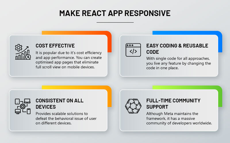
- Easy to work with: React Responsive library also helps you avoid writing @media rules in your CSS manually and saves you a lot of extra effort. The coding part gets easier to read and understand.
- Consistency: With the React responsive library, you can ensure that designs are consistent for all device screen sizes.
- Reusability: The components of the React-Responsive library can be easily reused in different parts of your website. You don't need to duplicate the code. It allows your designs to be more modular.
- Community support: React-Responsive is an established library widely used by the ReactJS open-source community. It offers you community help and support.
Now! You may be wondering how to use the React Responsive Library. Well! Here is a brief!
First of all, install npm to use the react responsive library with the code:
npm install --save react-responsive
When the library is installed, you can now import it into the React Component. You can do it by
usage with hooks or by components. Let's consider each example.
Usage With Hooks:
import React from 'react'
import { useMediaQuery } from 'react-responsive'
const Example = () => {
const isDesktopOrLaptop = useMediaQuery({
query: '(min-width: 1224px)'
})
const isonBigScreen = useMediaQuery({ query: '(min-width: 1824px)' })
const isonTabletOrMobile = useMediaQuery({ query: '(max-width: 1224px)' })
const isonPortrait = useMediaQuery({ query: '(orientation: portrait)' })
const isonRetina = useMediaQuery({ query: '(min-resolution: 2dppx)' })
return <div>
<h1>Device Test!</h1>
{isDesktopOrLaptop && <p> You are on a desktop or laptop</p>}
{isBigScreen && <p>You have a huge screen</p>}
{isTabletOrMobile && <p> You are on a tablet or using mobile </p>}
<p>Your are in {isPortrait ? 'portrait' : 'landscape'} orientation</p>
{isRetina && <p>You are retina</p>}
</div>
}
Here, the react component uses a hook to check the screen size and orientation of the user's device and displays different messages based on the results. It says if you are on a tablet or using a mobile device with a maximum width of 1224px, or it will display a message that you are on a desktop or laptop if it has a minimum width of 1824px. Similarly, if the device has a minimum resolution of 2dppx, it will display a message saying, "You are retina."
Usage With Components:
import MediaQuery from 'react-responsive'
const Example = () => (
<div>
<h1>Device Test!</h1>
<MediaQuery maxWidth={1224}>
<p>You are on a mobile or tablet </p>
<MediaQuery minWidth={1824}>
<p>You a desktop or laptop</p>
</MediaQuery>
</MediaQuery>
<MediaQuery minResolution="2dppx">
{(matches) =>
matches
? <p>You are retina</p>
: <p>You are not retina</p>
}
</MediaQuery>
</div>
)
Here, the react component uses a component to check the screen size and orientation of the user's device and displays different messages based on the results. The Example function uses MediaQuery to check the device's width or resolution and display a corresponding message for each condition.
Conclusion
Most internet traffic comes from mobile devices, making it essential to prioritize mobile-first design. Here, you can start the design process with the most minor screen size in mind and then work up to larger screen sizes. It ensures that the most important content is visible on mobile devices and that the design scales up gracefully for larger screens.