29 Sep, 2021
How does a Mobile Friendly Website Affect User and SEO?

We are currently in the digital age, and consumers spend a lot of time on their smartphones and other devices. It requires businesses to tweak their marketing strategies and jump onto the digital bandwagon. With the business environment getting more competitive, brands are looking for newer ways to stay ahead of their peers. The audience is online mainly, which requires businesses to reach out to them on the platforms where they are present.
Businesses must adhere to website best practices as they communicate their messages to their audience. You can reach out to most of your target market by having a mobile-friendly website. It will allow you to enhance brand awareness and improve conversions for you. This article will discuss the benefits it provides and the steps to take to ensure a mobile-friendly website.
What is a Mobile Friendly Website?
As more people use their smartphones to stay online, it becomes necessary to have a seamless online experience. You must optimise your website to look elegant and professional even when viewed on a handheld device. The audience will be using different devices, and they must have a seamless experience when visiting your website.
These mobile optimised websites ensure that visitors do not face issues while on the website. Keep in mind that if the visitor faces any problems while on the site, they will abandon the site readily. Therefore, design the website such that the visitors can navigate the website easily. The design must be elegant, and the font and colours should look professional.
Why do you need a Mobile Friendly Website?
Recent studies show that mobile-friendly websites gain SEO brownie points. A responsive website can improve conversions as your target market will not prefer a poorly designed one. Let us discuss further why a mobile-friendly website design suits your business.
Search Engines use it as a Ranking Factor
Google had released an official statement in 2015 that it would use mobile optimisation as a ranking factor. The search engine would help internet users easily find responsive and optimised websites for viewing on handheld devices. Therefore, it is necessary to optimise your website for mobile visitors too to gain SEO brownie points. A Mobile Boost update confirmed the impact that mobile responsiveness would have on website rankings.
Penalty on Mobile Intrusive Interstitials
Mobile websites that are not optimised are penalised by Google. In January 2017, they came up with an update that penalised websites that used certain interstitials that seemed invasive on mobile devices. Some of them included one that visitors had to dismiss before accessing the content. Some others displayed a pop-up covering the page content when the visitor landed through a search result. The ones not penalised were those used for legal reasons or required login credentials.
Focus on Speed on Handheld Devices Too
Google was already using desktop loading speed as a ranking parameter for keyword searches. However, in July 2018, they announced that they included it as a ranking factor for mobile searches. It would mean that slow-loading pages on smartphones would be penalised in rankings.
Default Mobile-First Indexing
In May 2019, Google stated that mobile-first indexing would be a default parameter for search results. It would also be an essential parameter for newer websites. It meant that the search engine would crawl the site to check for its responsiveness for mobile and desktop users. As a result, the need for a mobile optimised website increased, and the site's compatibility depended on several factors.
Few Mobile-Friendly Website Best Practices
Almost half of your website visitors will be through a mobile device. Therefore, it is necessary to design Google mobile optimised pages to stay ahead of your peers. We will discuss some of the best practices to ensure that your optimised websites for mobile devices.
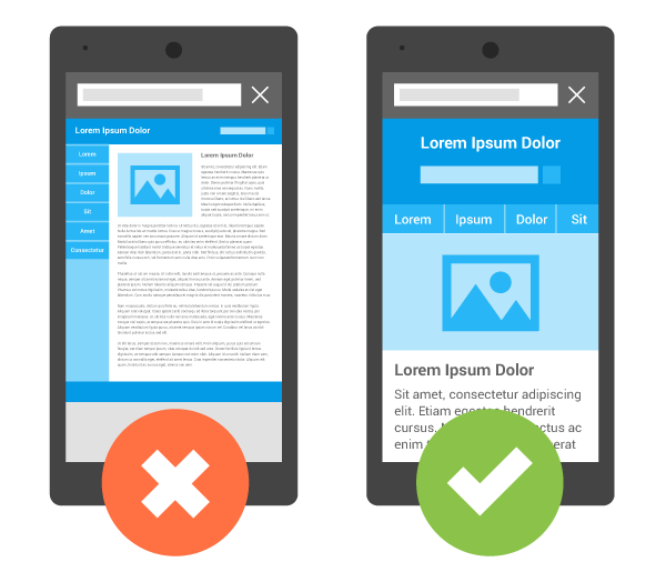
Have a Mobile-First Design
Mobile users will expect your mobile website to be a bit different structurally. You can restrict the homepage to have around four to eight navigation tabs. Instead of the Home tab, you can use the logo to make users visit the homepage. For multi-level navigation, you can use a vertical drop-down feature. Also, avoid pop-ups as much as possible.
Have the Essential Elements Within Reach
Many users only have one thumb to access the essential elements in a mobile site. The UX designers must keep in mind that touch accuracy is minimal at the edges of the screen. Always organise the content and carry out the interactions at the front and centre of the screen. You can place the other non-essential functions at the edges of the screen.
Write Mobile-Friendly Content
Content writers must create content keeping in mind the needs of mobile users. Never reduce the font size such that it creates problems for mobile users. The font size must be kept optimal and should be around 16 px and a line height of at least 1.5. Remember not to use any mouseover effects as it creates problems on a smaller device.
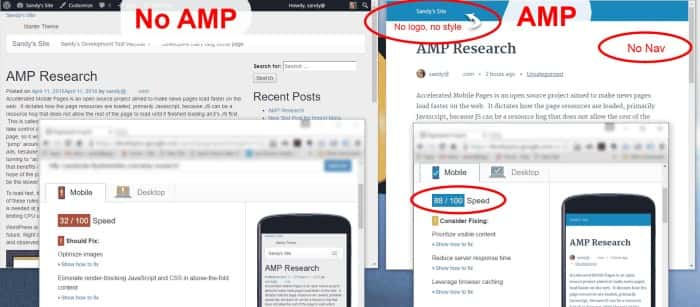
Use Accelerated Mobile Pages (AMPs)
The AMPs are Google mobile optimised pages that enjoy priority during search results. They ensure faster loading of web pages for users with handheld devices. It works by having the pages stripped to only the essential portions and store a cached version on the search engine servers. It is ideal for the users who would read the content faster rather than waiting for all the elements to download.
Optimise the Homepage
You must present the essential pages to the visitor. You can utilise historical analytics to decide on the critical web pages. For a bigger website, a search function can be of immense help. The navigation on the website must be easy to use and intuitive. Always use recognised icons to save space on the homepage. The CTAs must be placed at suitable positions on the page and keep the same themes across all devices.
Ensure Faster Loading Times
The visitors are bound to abandon the website if it takes too much time to load. You can have fewer elements on the web pages and optimise the images to ensure faster loading speeds. Also, scale the images using HTML markup and reduce file requests to ensure optimal loading speeds.
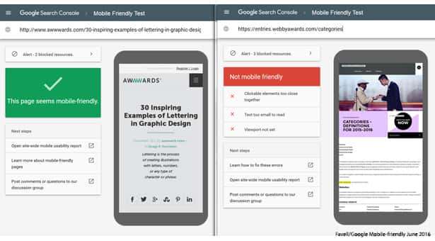
Check the Website for Mobile-Friendliness
You must use the recognised CMSs for your mobile site, with Drupal, WordPress, Joomla being the common ones. You must not use Flash on the website and keep away inefficient code too. Website developers must use the standard fonts that are easy to read by users with smaller screens. You can also use separate URLs for the mobile version and ensure that the pages open on both the mobile and desktop versions. You can use Google's Mobile-Friendly Test to be doubly sure that you have a mobile optimised website.
Conclusion
Most of the website visitors will be from handheld devices. A mobile-friendly website design will help you address the needs of these users, and you can communicate your messages better. Always take necessary steps to ensure that the website is optimised for mobile users, too. You will need the services of a professional website development agency to guide you through the process. Our website developers have immense experience in ensuring a website design suitable for both desktop and mobile users. We are happy to help you in your endeavours.


