13 Sep, 2019
How to simplify the layout of your website using Flexbox?

Have you ever scratched your head while working with CSS to make some simple layouts for your website? Are you fed up of running to the UI developers for small layout designs every time? Are you a UI / UX developer who is lost within complex CSS for some simple layout designs? Well, then my friend you are in the right place. Writing CSS to create layouts in a traditional way using float, margin, padding, etc. are tedious and after the year 2009 is not recommended. Its is better to use Flexible box or Flexbox in short.
How is it different and why should we use it?
Well for starters Flexbox is:
- Widely supported across desktop and mobile browsers.
- Creating repeatable elements is quick and easy.
- Combining Flexbox with media queries creates flexible, mobile-friendly web elements.
- Can have display order of elements reversed or rearranged at the style layer.
- Achieving equal-column layouts (irrespective of the amount of content inside each column) is a breeze.
- It is the future of grid design.
AND, FINALLY
- Centering elements is EASY! Yes, you heard it right, it is very easy.
So let’s get Started -
Flexible Box, or Flexbox, in short, is a set of properties in CSS introduced in 2009 to provide a new, exceptional layout system. The Flexbox module is identified as a part of the third version of CSS (CSS3). It is the unidirectional way layout components of your website one at a time. Elements can only be ordered in either a row or a column when the display is set to "flex" then ordered and spaced to it's desired position. The Flexbox Layout (Flexible Box) module (a W3C Candidate Recommendation as of October 2017) aims at providing a more efficient way to layout, align and distribute space among items in a container, even when their size is unknown and/or dynamic (thus the word "flex").
For ease and brevity, I quickly learned the importance of creating containers for all of my items/child elements.
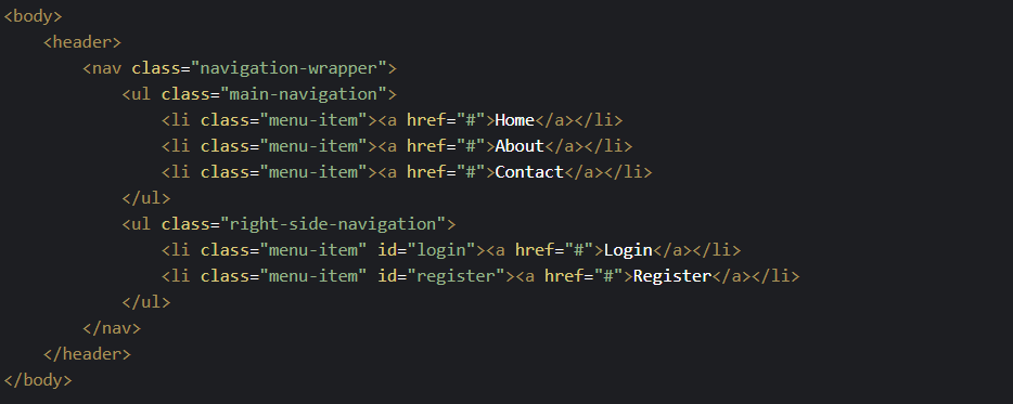
The first feature I tackled in creating my blog was the nav-bar. Creating a nav-bar in CSS Flexbox was simpler than I thought. Here's a snippet of the code I used.
THE BACKBONE
THE MAGICAL CSS
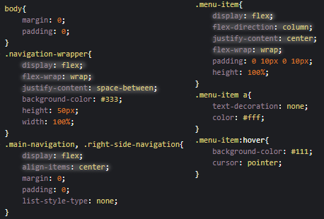
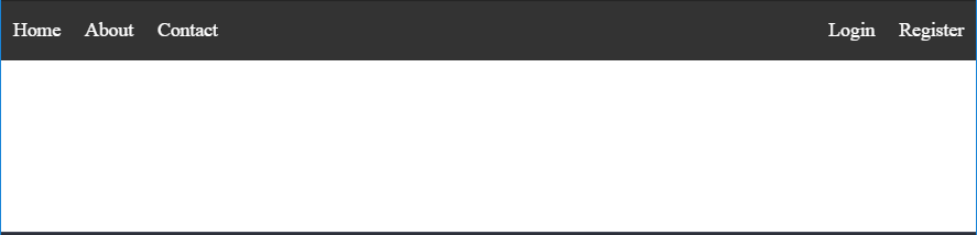
You can see that with flex(the highlighted part, remaining is for extra beautification) how easily the below navbar is generated.
THE NAVBAR
Want hands-on? Visit Codepen
Basics & Terminology
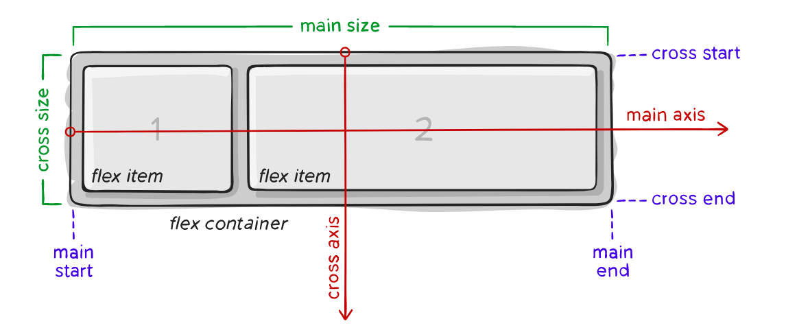
Items will be laid out following either the main axis (from main-start to main-end) or the cross axis (from cross-start to cross-end).
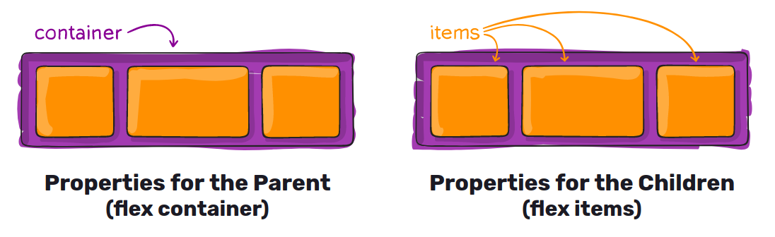
Let’s start with the Container Properties
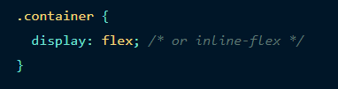
display
This defines a flex container; inline or block depending on the given value. It enables a flex context for all its direct children.
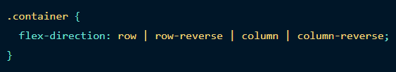
flex-direction
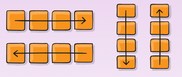
This establishes the main-axis, thus defining the direction flex items are placed in the flex container. Flexbox is (aside from optional wrapping) a single-direction layout concept. Think of flex items as primarily laying out either in horizontal rows or vertical columns.
- row (default): left to right in ltr; right to left in rtl
- row-reverse: right to left in ltr; left to right in rtl
- column: same as row but top to bottom
- column-reverse: same as row-reverse but bottom to top
flex-wrap
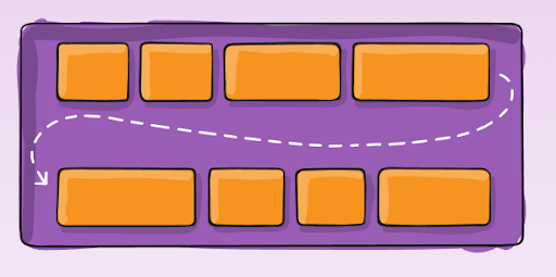
By default, flex items will all try to fit onto one line. You can change that and allow the items to wrap as needed with this property.
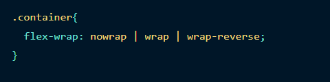
- nowrap (default): all flex items will be on one line
- wrap: flex items will wrap onto multiple lines, from top to bottom.
- wrap-reverse: flex items will wrap onto multiple lines from bottom to top.
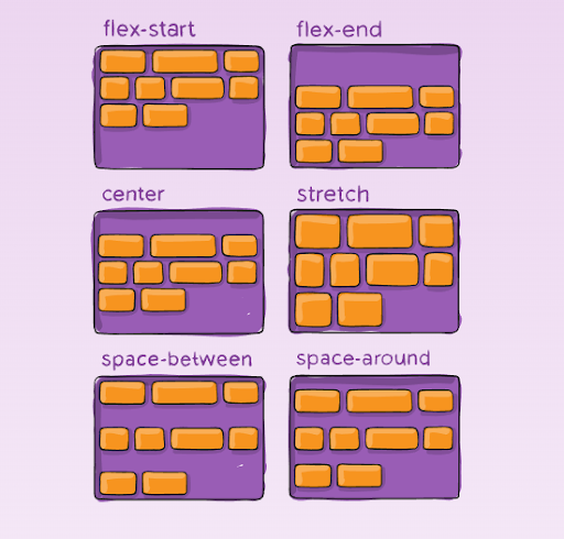
justify-content
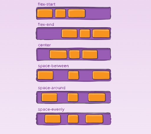
This defines the alignment along the main axis. It helps distribute extra free space leftover when either all the flex items on a line are inflexible, or are flexible but have reached their maximum size. It also exerts some control over the alignment of items when they overflow the line.

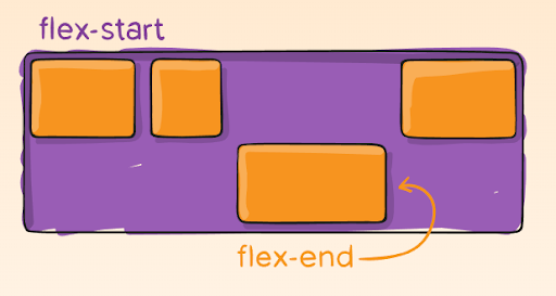
- flex-start (default): items are packed toward the start line
- flex-end: items are packed toward the end line
- center: items are centred along the line
- space-between: items are evenly distributed in the line; the first item is on the start line, last item on the end line
- space-around: items are evenly distributed in the line with equal space around them. Note that visually the spaces aren't equal since all the items have equal space on both sides. The first item will have one unit of space against the container edge, but two units of space between the next item because that next item has its own spacing that applies.
- space-evenly: items are distributed so that the spacing between any two items (and the space to the edges) is equal.
align-items
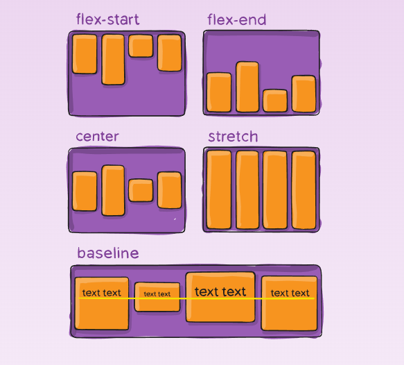
This defines the default behaviour for how flex items are laid out along the cross axis on the current line. Think of it as the justify-content version for the cross-axis (perpendicular to the main axis).
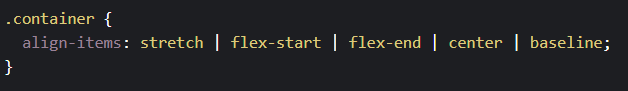
- stretch (default): stretch to fill the container (still respect min-width/max-width)
- flex-start: cross-start margin edge of the items is placed on the cross-start line
- flex-end: cross-end margin edge of the items is placed on the cross-end line
- center: items are centred in the cross-axis
- baseline: items are aligned such as their baselines align
align-content
This aligns a flex container's lines within when there is extra space in the cross-axis, similar to how justify-content aligns individual items within the main-axis.
Note: this property has no effect when there is only one line of flex items.
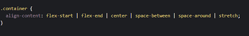
- flex-start: lines packed to the start of the container
- flex-end: lines packed to the end of the container
- center: lines packed to the center of the container
- space-between: lines evenly distributed; the first line is at the start of the container while the last one is at the end
- space-around: lines evenly distributed with equal space around each line
- stretch (default): lines stretch to take up the remaining space
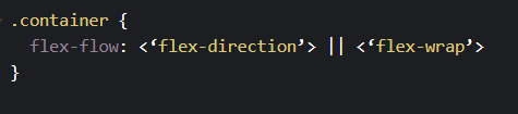
flex-flow (Applies to: parent flex container element)
This is a shorthand for the flex-direction and flex-wrap properties, which together define the flex container's main and cross axes. The default value is row nowrap.
Now let’s see the Item Properties
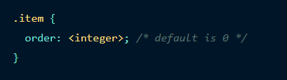
order
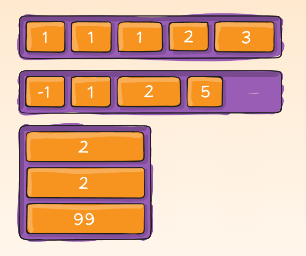
By default, flex items are laid out in the source order. However, the order property controls the order in which they appear in the flex container.
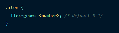
flex-grow
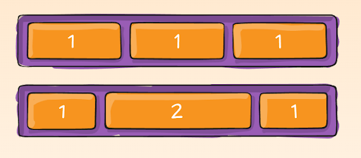
This defines the ability for a flex item to grow if necessary. It accepts a unitless value that serves as a proportion. It dictates what amount of the available space inside the flex container the item should take up.
If all items have flex-grow set to 1, the remaining space in the container will be distributed equally to all children. If one of the children has a value of 2, the remaining space would take up twice as much space as the others (or it will try to, at least).
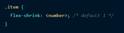
flex-shrink
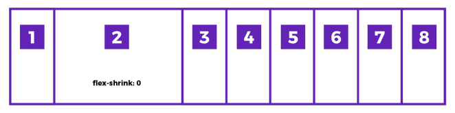
This defines the ability for a flex item to shrink if necessary.
Negative numbers are invalid.
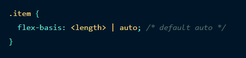
flex-basis
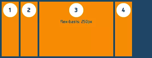
This defines the default size of an element before the remaining space is distributed. It can be a length (e.g. 20%, 5rem, etc.) or a keyword. The auto keyword means "look at my width or height property" (which was temporarily done by the main-size keyword until deprecated). The content keyword means "size is based on the item's content" - this keyword isn't well supported yet, so it's hard to test and harder to know what its brethren max-content, min-content, and fit-content do.
If set to 0, the extra space around content isn't factored in. If set to auto, the extra space is distributed based on its flex-grow value
align-self
This allows the default alignment (or the one specified by align-items) to be overridden for individual flex items.
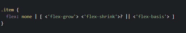
flex
This is the shorthand for flex-grow, flex-shrink and flex-basis combined. The second and third parameters (flex-shrink and flex-basis) are optional. Default is 0 1 auto.
It is recommended that you use this shorthand property rather than set the individual properties. The short handsets the other values intelligently.
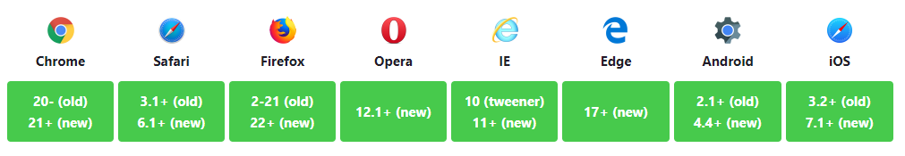
Prefixing Flexbox
Flexbox requires some vendor prefixing to support the most browsers possible. It doesn't just include prepending properties with the vendor prefix, but there are actually entirely different property and value names. This is because the Flexbox spec has changed over time, creating an "old", "tweener", and "new" versions.
Perhaps the best way to handle this is to write in the new (and final) syntax and run your CSS through Autoprefixer, which handles the fallbacks very well.
Broken up by "version" of flexbox:
- (new) means the recent syntax from the specification (e.g. display: flex;)
- (tweener) means an odd unofficial syntax from 2011 (e.g. display: flexbox;)
- (old) means the old syntax from 2009 (e.g. display: box;)
Bugs
Flexbox is certainly not without its bugs. The best collection of them I've seen is Philip Walton and Greg Whitworth's Flexbugs. It's an open-source place to track all of them, so I think it's best to just link to that.
Source: CSS-Tricks , toptal